AI-powered learning
Save this course
Data Visualizations with ggplot2 in R
Gain insights into using ggplot2 in R to create compelling visualizations. Learn about scatter plots, bar charts, customizing themes, and building interactive maps to enhance data storytelling.
5.0
41 Lessons
2 Projects
10h
Join 2.9 million developers at
Join 2.9 million developers at
LEARNING OBJECTIVES
- An understanding of data visualization principles and applying them effectively
- Working knowledge of ggplot2 in R and its diverse features
- The ability to apply grammar of graphics, including aesthetics and annotations for complex, layered visualizations
- A mastery of ggplot2 components for impactful charts
- Hands-on experience creating data visualizations using ggplot2 extension packages
- Hands-on experience developing visualizations in ggplot2, including faceted, interactive plots, and maps
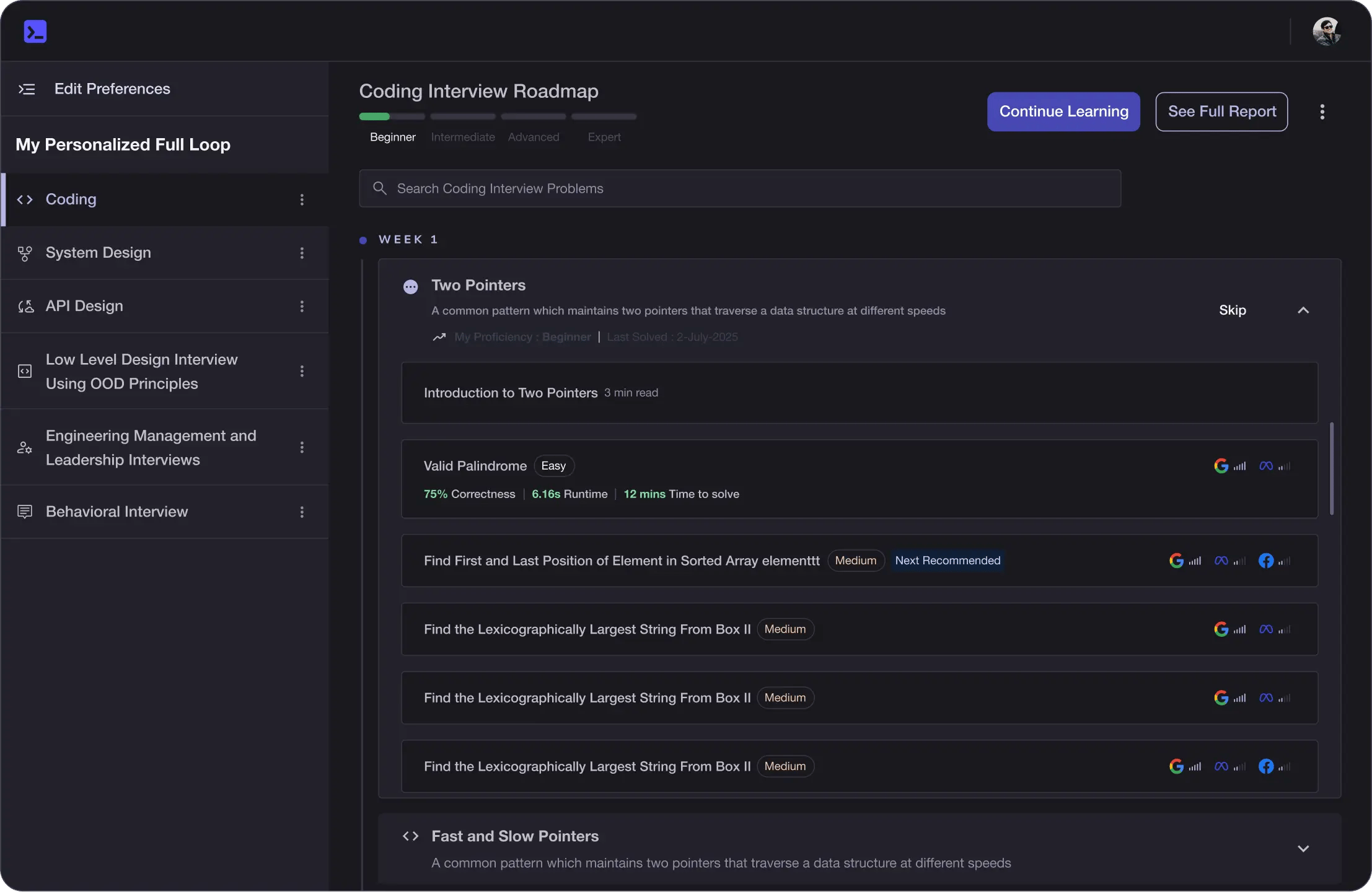
Learning Roadmap
1.
Welcome to the Course
Welcome to the Course
Get familiar with data visualization using ggplot2, ideal for data professionals and R beginners.
2.
Introduction to ggplot2
Introduction to ggplot2
Look at the fundamentals of ggplot2, focusing on its grammar of graphics, layered elements, and advanced aesthetics.
3.
Drawing Basic Plots Using ggplot2
Drawing Basic Plots Using ggplot2
6 Lessons
6 Lessons
Work your way through creating scatter plots, line charts, bar charts, histograms, and pie charts using ggplot2.
4.
Advanced Plots
Advanced Plots
8 Lessons
8 Lessons
Apply your skills to creating advanced plots like boxplots, violin plots, and heatmaps.
5.
Plot Customization
Plot Customization
7 Lessons
7 Lessons
Dig deeper into enhancing ggplot2 visualizations with themes, titles, fonts, colors, lines, and legends.
6.
Creating Panel of Plots
Creating Panel of Plots
5 Lessons
5 Lessons
Investigate methods for arranging multiple plots using faceting, patchwork, cowplot, and ggpubr in ggplot2.
7.
Building Interactive Plots
Building Interactive Plots
2 Lessons
2 Lessons
Master interactive plotting with ggiraph and enhance ggplot2 maps using plotly for dynamic data visualization.
9.
Appendix
Appendix
2 Lessons
2 Lessons
Get started with installing ggplot2 and leveraging diverse reference datasets for robust data visualizations.
Certificate of Completion
Showcase your accomplishment by sharing your certificate of completion.
Complete more lessons to unlock your certificate
Developed by MAANG Engineers
ABOUT THIS COURSE
Data visualization in R using ggplot2 is an essential skill for data professionals and enthusiasts to efficiently discover and convey insights from datasets. Mastering ggplot2 allows you to uncover hidden patterns and trends in data, boosting decision-making and storytelling for a wide range of audiences.
In this comprehensive course, you’ll begin by learning data visualization principles and the grammar of graphics. Progressing to ggplot2’s core functionalities, you’ll create scatter plots, bar charts, line graphs, histograms, and more explore advanced visualization through customizations and themes to create visually engaging plots. You’ll also be building interactive visualizations and captivating maps.
By the end of this course, you’ll confidently generate engaging data visualizations in R, transforming yourself into an effective data communicator. You’ll also be able to elevate your data visualization skills with ggplot2 and excel as a data storyteller while enhancing your data science career.
ABOUT THE AUTHOR
Devashree Madhugiri
I'm an engineer with an M.Eng. in IT(Germany), an experienced data analyst, a technical AI and data science blogger, and a consultant with a passion for data visualization and simplifying complex topics in ML and DL.
Trusted by 2.9 million developers working at companies
A
Anthony Walker
@_webarchitect_
E
Evan Dunbar
ML Engineer
S
Software Developer
Carlos Matias La Borde
S
Souvik Kundu
Front-end Developer
V
Vinay Krishnaiah
Software Developer
Built for 10x Developers
No Passive Learning
Learn by building with project-based lessons and in-browser code editor
Personalized Roadmaps
The platform adapts to your strengths & skills gaps as you go
Future-proof Your Career
Get hands-on with in-demand skills
AI Code Mentor
Write better code with AI feedback, smart debugging, and "Ask AI"
MAANG+ Interview Prep
AI Mock Interviews simulate every technical loop at top companies