Making CSS Grid work with Flexbox
In this part, you’ll learn to make Flexbox and the CSS Grid work together — peacefully.
These two technologies, Flexbox and Grid, have changed how layouts in CSS is approached. Where possible, it is efficient to use both technologies.
Let’s delve in.
For the section housing the music details, we will use Flexbox.

How do you know where to use Flexbox?
As a general rule of thumb, it is appropriate to use Grid to layout the overall page layout, and Flexbox for inner UI components.
A grid item can be a flex container. A flex item can also be a grid container. The latter is frequently used though.
I assume you have a decent grasp of flexbox from a previous lesson.
As always, begin with the html
Below is a div, with a list of songs. The list of songs have paragraphs containing the name of the song, artiste, duration of the song and “catty cloud sync.”
<div class="main__body">
<div>
<p>1. One Dance</p>
<p>Crake feat CatKid & Cyla</p>
<p>2:54</p>
<p><span>CATTY CLOUD SYNC</span></p>
</div>
<div>
<p>2. Panda</p>
<p>Cattee</p>
<p>4:06</p>
<p><span>CATTY CLOUD SYNC</span></p>
</div>
<div>
<p>3. Can't Stop the Feeling!</p>
<p>Catin Cimberlake</p>
<p>3:56</p>
<p><span>CATTY CLOUD SYNC</span></p>
</div>
<div>
<p>4. Work From Home</p>
<p>Cat Harmony feat Colla</p>
<p>3:34</p>
<p><span>CATTY CLOUD SYNC</span></p>
</div>
</div>
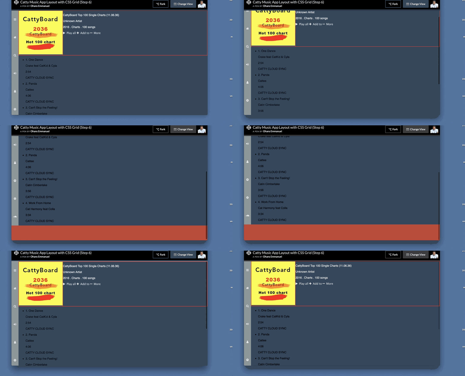
Here’s what we’ve got:

.main__body is a grid item. We could make it a flex container if that was any useful.
For our use case, each direct div child of .main__body needs to be flex container. This is the div that contains the name of the song, artiste, duration of the song and “catty cloud sync”.
.main__body > div {
  display:flex;
}
Now split the width amongst the children elements:
.main__body > div p{
  flex: 0 0 25%;
}

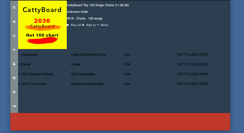
You’ll agree with me that at this point, the essentials of the layout is done. Yes ✅
Hae a look at the playground below:
Get hands-on with 1400+ tech skills courses.