Responsive Design — Redefining Grid Areas with Media Queries
The Grid areas you create within the parent grid container are not set in stone. The grid areas can be changed based on the screen size of the user’s device.
We'll cover the following
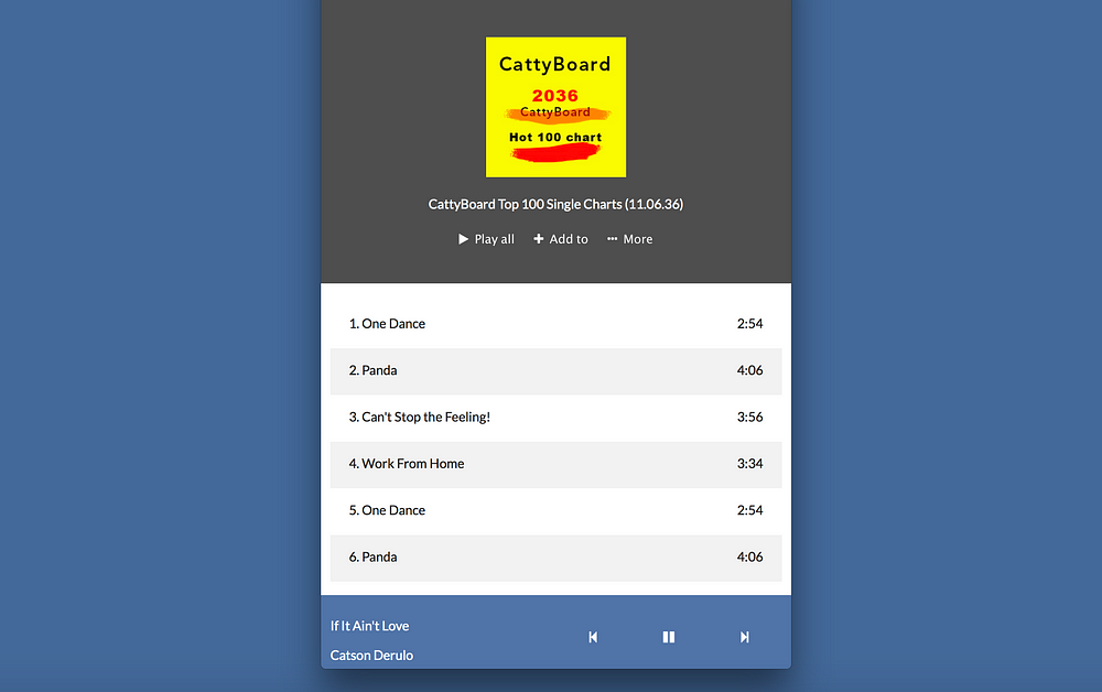
The image below shows what we aim to achieve on mobile displays.

For our specific use-case we will do some refactoring for a mobile first approach.
Mobile first is simply making your default styles those for mobile devices. Then you may go ahead to make changes for larger displays via media queries.
Let’s tweak the current code we have now. Wrap the grid defining bit in a media query.
Like this:
@media only screen and (min-width: 600px) {
    body {
        grid-template-columns: 120px 1fr;
        grid-template-areas: "sidebar  content"
                             "footer   footer";
         }
}
Oh my! What is @media ? #
Did you see the bit of code above? This one:
@media only screen and (min-width: 600px)
Let me explain that. Feel free to skip this if you’re not new to responsive designs.
I am still working on the Responsive design section of this course. For now, let me explain what media queries are.
In the responsive design section, we will do due justice to media queries and other components of Responsive design.
Media Queries #
Media queries are at the heart of responsive design. They let you target specific screen sizes and specify code to be run on the devices alone.
The most popular form in which media queries are used is something called the @media rule.
It looks like this:
@media screen and (max-width: 300px) {
  /*write your css in this code block*/

}
Looking at it, you can almost guess what that does.
“For a screen device with a maximum width of 300px … do this and that ”
Any styles within the code block will only apply to devices that match the expression, screen and (max-width: 300px) i.e screen devices with a maximum width of 300px.
I guess that helped clear up some confusion.
Back to building the music layout.
You should leave the defaults excluded from the media query.
body {
    display: grid;
    grid-template-rows: 1fr 50px;
}
Why do I have ‘grid-template-rows: 1fr 50px’ excluded from the media query?
This is because both mobile and desktop screens will have the same row definition. 2 rows.
But on desktop devices, there’s a sidebar. The sidebar accounts for the 120px in the grid-template-columns definition. However, the sidebar is non-existent on mobile devices.
Thus, we will redefine the grid-template-column declaration for mobile.
Now for mobile devices, we will leave this as the default styling. i.e not wrapped in any media query.
body {
   grid-template-areas: "content"
                        "footer"
Pretty simple?
Let me explain.
The default flow (direction) of a Grid #
The code block for mobile displays is easy.
body {
   grid-template-areas: "content"
                        "footer"
However, note that there was no need to specify grid-template-columns
By default, a grid container will align it’s children along rows.
So, the declaration above will align content along a row, and footer along another. Below is the result of that — the sidebar hidden on mobile.

With the initial hurdle of understanding how grids work, and setting up a responsive grid, let’s finish up the app layout!
Get hands-on with 1400+ tech skills courses.