Placing Content within the Grid.
At the end of this section, we will have the built the Catty Music app layout.
The focus of this lesson is to place and align content within grids.
Let’s get started.
1. Placing Content Within the Sidebar
This looks like the easiest to start with. Let’s go for it.
The sidebar consists of 8 icons equally spaced out vertically across the entire length of the sidebar.
Insert the icons, like this:
<div class="aside">
      <i class="fa fa-bars"></i>
      <i class="fa fa-home"></i>
      <i class="fa fa-search"></i>
      <i class="fa fa-volume-up"></i>
      <i class="fa fa-user"></i>
      <i class="fa fa-spotify"></i>
      <i class="fa fa-cog"></i>
      <i class="fa fa-soundcloud"></i>
</div>
Below is the result of that:
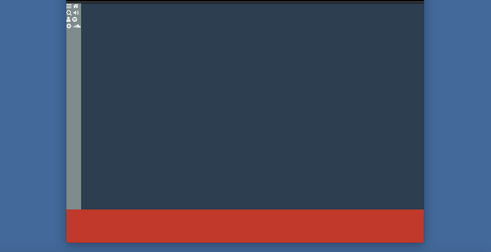
Also, hide the icons when on mobile. Show them when the app is visited on a larger screen. This is the mobile first approach.
.aside i {
  display: none;
}

@media only screen and (min-width:600px) {
  .aside i {
    display: block;
  }
}
The icons are displayed, but poorly aligned.
Aligning the icons
The i tags are inline elements — which explains why every 2 icons sit on one line.
Let’s fix the arrangement.
Grid items can be grids themselves. Why not
Step 1: Make the Sidebar a Grid Container
This will give access to using the grid’s alignment features.
Since the sidebar is only seen on larger screens, do not forget to wrap this in the media query.
@media only screen and (min-width:600px) {

  .aside {
     display: grid;
  }

  .aside i {
    border: 1px solid red;
  }
}
I have gone ahead to add borders to each icon so they are visually distinguishable.
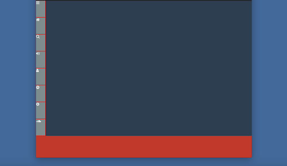
What’s happening there?
We have NOT set up any rows or columns within the sidebar. But we have the icons laid out fairly well.
The grid auto-placement algorithm has set in.
This is got to do with the default placement of items in a grid — along a row.
Also, the grid items are arranged to take up the space of the grid container, as needed.
Here comes the sweet sauce.
A grid may align its items using any of properties justify-items or align-items.
justify-items will align the items along the row axis.
In most cases, the row is pretty much synonymous with the horizontal direction.
align-items will align the items along the column axis.
In most cases, the column is also synonymous with the vertical direction.
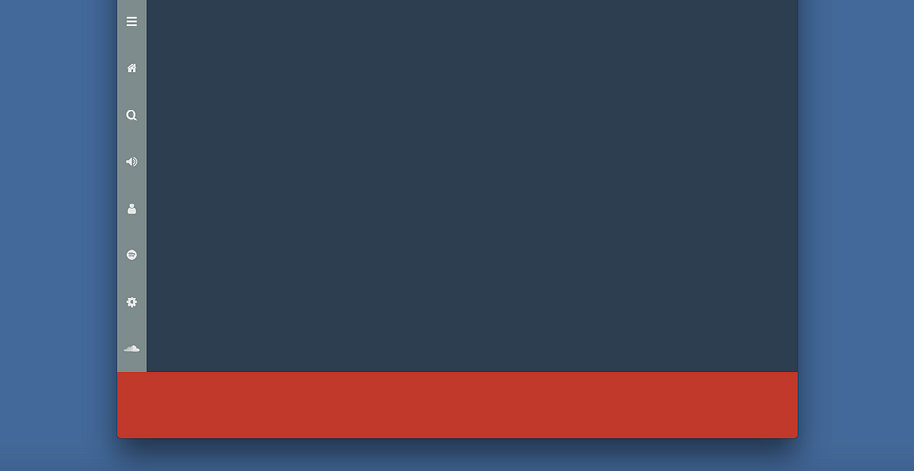
Apply this to the sidebar, and we have perfectly laid out icons.
.aside {
     ...
     justify-items: center;
     align-items: center;
  }
Still confused, watch the changes in the sidebar items as I type.
Now we have perfectly laid out icons within the sidebar.
A few other values justify-items and align-items can take include:
stretch
start
end
center
If you’ve worked with Flexbox, these should be familiar.
We’ll proceed to place more content into the current design.
Target the main section, the dark blue section in the image above. Place two div within:
<div class="main">
  <div class="main__header"></div>
  <div class="main__body"></div>
</div>
NB:
.main__headerwill contain the music art and playbacks.

.main__bodywill house the details:
In this section, we will focus on .main__header
First off, add the required html
<div class="main__header">
<div class="img">
<img src="http://bit.ly/2sc2NJd"/>
</div>
<section class="details">
<div>
<p>CattyBoard Top 100 Single Charts (11.06.36)</p>
<p class="sm--hide">Unknown Artist</p>
<p class="sm--hide">2016 . Charts . 100 songs</p>
</div>
<div>
<i class="fa fa-play"> Play all</i>
<i class="fa fa-plus"> Add to</i>
<i class="fa fa-ellipsis-h"> More</i>
</div>
</section>
</div>
Note the way the document is structured.
.main__header has two direct children. A div that contains an image, and a section that contains album details, .details
The result of the addition above is this rather ugly image:

Let’s make this pretty.
What we need is a grid that aligns its children appropriately. Let’s make use of your new knowledge of grid areas.
The first step is to define the grid areas:
.main__header > .img {
  grid-area: img;
}
.main__header > .details {
  grid-area: dtls;
}
The div containing the image has been named img
The section containing the album details has been named dtls
Now, define the grid itself:
.main__header {
  display: grid;
  grid-template-areas: "img"
                       "dtls";
}
.main__header sets a grid formatting context. The areas have also been aligned to stack vertically on another. .img first, then dtls
This is because we are working with a mobile-first approach. Good.
At this point, nothing much has changed.
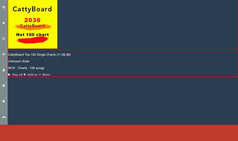
This is NOT the view we want on mobile. For mobile screens, the items should be aligned to the center. Let’s fix that.
@media screen and (max-width: 600px) {
  .main__header {
    justify-items: center;
  }
}
Now the grid items will be positioned to the center of the grid (along the row)
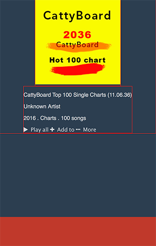
Make the text in .detailsalign to the center:
@media screen and (max-width: 600px) {
  .main__header > .details {
    text-align: center;
  }
}
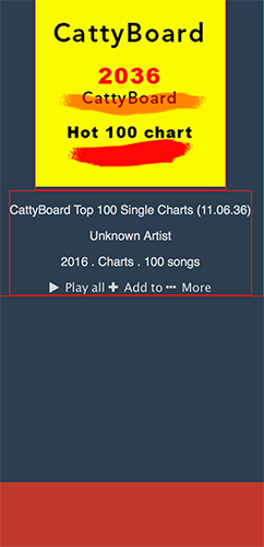
We are pretty close to the end goal. Just a few more tweaks.
Don’t wory, there’s a playground to catch up on all these changes!
The paragraphs with the text, unknown artist, and 2016. Charts. 100 songs. should be hidden on mobile.
The image should be smaller too.
@media screen and (max-width: 600px) {
  .sm--hide {
    display: none;
  }
  .img > img {
    width: 150px
  }
}
As a reminder, display: none will hide whatever element it is applied to.
Every class .sm--hide will be hidden on mobile. Just add this class to the desired element.
Here’s how:
<p class="sm--hide">Unknown Artist</p>
<p class="sm--hide">2016 . Charts . 100 songs</p>
And we have this:
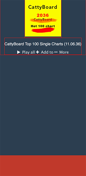
Having sorted out the view on mobile, let’s fix that for larger screens.
Back to the parent grid.
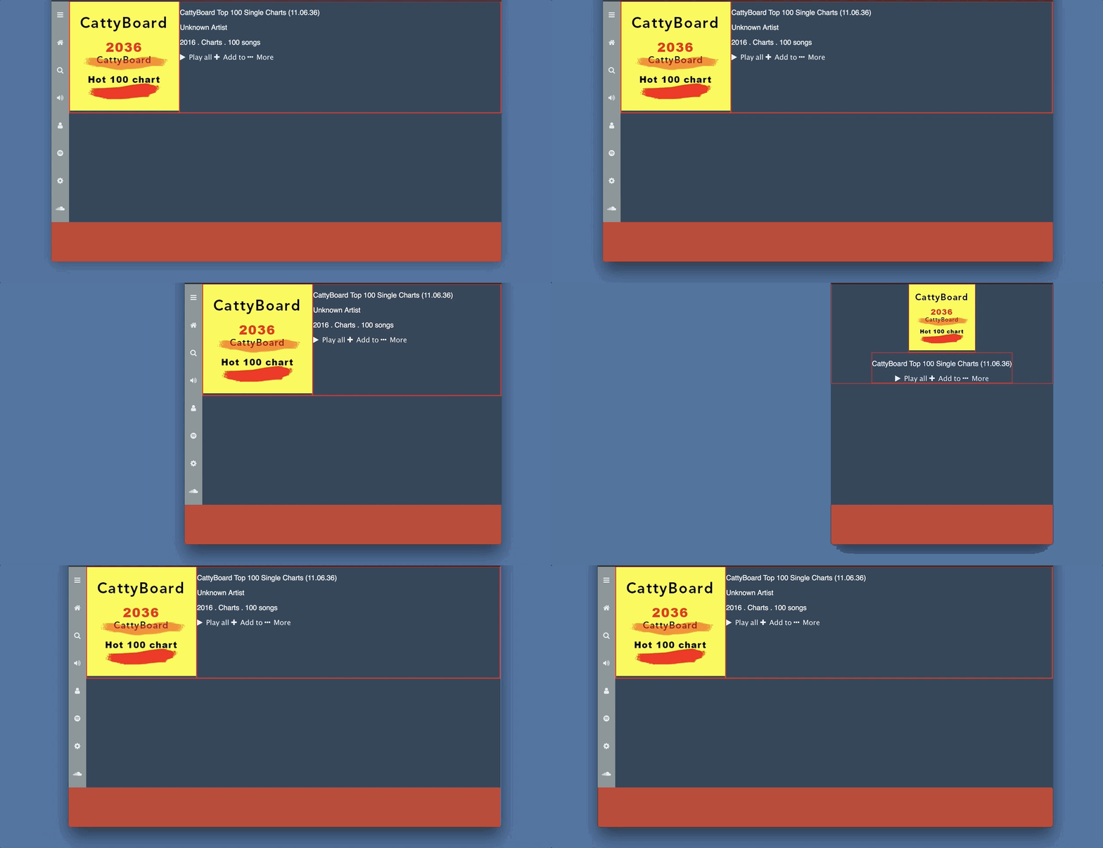
For larger screens, we need a 2 column grid. The areas should be split like this:
@media only screen and (min-width:600px) {
   .main__header {
    grid-template-columns: 250px 1fr;
    grid-template-areas: "img dtls"
  }
}
I’m sure you understand what’s going on there. The grid has been redefined to have two columns. One fixed at 250px and the other to fill the remaining space.
Get hands-on with 1400+ tech skills courses.